The whole point of the process is to improve the quality of the large projects that get built in this city. It works best when architect, developer and community take one another’s feedback into account. Lincoln Square shows what results when that happens.
By Sandy Smith
When designing projects, large or small, architects should take into account more than just the needs and wants of the client in fashioning them. They should also take into account how the project will fit in with (or stand out from) its surroundings and the impact it will have on how the urban fabric functions. A series of videos recently released by BLT Architects (BLTa), one of this city’s largest and best-known firms, gives some insight into how this process works, or is supposed to.
Of course, aesthetic considerations should also come into play, and here, the track record is as mixed as the contextual one is. The building featured in the videos, the BLTa-designed East Market development, is a splendid example of taking urban context into account in site design, but aesthetically, it perhaps fits in too well with its surroundings, with a residential tower that more closely resembles its (former) office-building neighbors than distinguishes itself from them as a place where people will actually live.
The 2012 revision of Philadelphia’s zoning code included a new process intended to prod architects to dive deeper into these aspects of the design process for large projects on both functional and aesthetic grounds. But as the Civic Design Review panel, whose job it is to do the prodding, only plays an advisory role, it remains up to the architect and client to determine whether and how they do that diving.
Some of the time, as happened with Bart Blatstein’s proposed mixed-use development at 1001 South Broad, the result is only a perfunctory consideration of major issues, or their complete dismissal, while minor tweaks are made at the edges to address those concerns the developer or architect are willing to address. But when an architect and a client engage in this process from the start, and then take the feedback from the CDR panel to heart, the result makes a good project better.
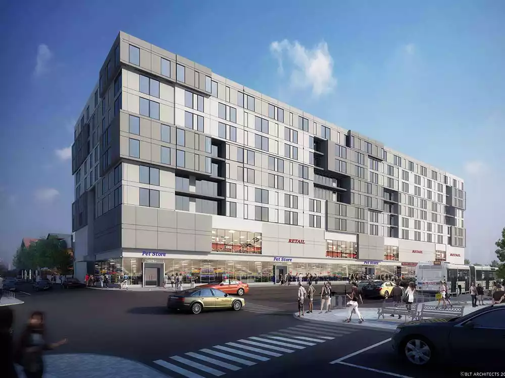
Such is the case with BLTa’s Lincoln Square project, across the street from the now-stalled Blatstein project. (The firm has also produced a series of videos describing this project’s evolution.)
The project had good bones to begin with. At 10 stories tall, the joint development by Alterra Property Group and MIS Capital didn’t tower over its neighborhood the way Blatstein’s did, to the loud objections of near neighbors. Its parking component was partly buried and tucked behind the retail-apartment building’s street frontages, thus eliminating the huge podium that made internal circulation impossible on the Blatstein site. And it incorporates a historic Pennsylvania Railroad freight shed in a creative way that will serve its neighborhood well if, as the developers want, a supermarket occupies it. (Another architectural firm, Kelly/Maiello, was brought in to revise the design of the freight shed.)
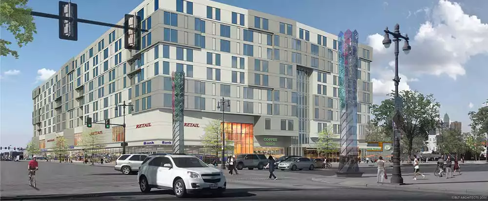
But the building itself was as uninspired in its aesthetic as East Market was: a relatively undifferentiated box of three broad horizontal bands interrupted only by a vertical glass shaft above the main entrance to the apartments, with a few voids along its Washington Avenue elevation. This version was what BLTa first submitted to the Civic Design Review panel last spring.
It turns out, however, that this design was not the final word on the project’s appearance. The architects both took changing expectations on the part of the developers and feedback from the community into account after releasing those initial drawings, and as a result, what ended up getting submitted to CDR was the same thing, only different – and more visually interesting.
“The original building had homogeneous facades along Washington Avenue, Broad Street and 15th, with end bays being the sole differentiation to reflect the structural brace framing behind,” said BLTa principal Michael Prifti. “After constructive criticism from others, in the second iteration, we imparted a more sophisticated rhythm in three bands on the residential portion.
“One of the owners saw what we were doing and walked in with a piece of art by Joseph Albers. He said, ‘I see what you’re doing, and this resonated with me.’” Albers was a German modernist whose works focused on color and form, most of them featuring nested squares or overlapping rectangular forms that offered the illusion of depth on a two-dimensional flat surface.
This helped spark BLTa’s reworking of the apartments to add some actual three-dimensional depth and variety to the facade. Also helping this process along were comments from members of the South of South Neighborhood Association (SOSNA) and City Councilman Kenyatta Johnson. “We met with SOSNA several times during this period, incorporating much of their comments” into the redesign, Prifti said, adding that they did the same with Planning Commission staff.
BLTa also added a second level of retail to the building in response to interest from possible tenants without changing the building’s overall height or apartment count.
The result of this process was an apartment tower with a far more syncopated facade. The windows are much less regimented, and the variation produces more distinctive interior layouts as window positions vary from unit to unit. Blocks of windows project from and recede behind the main plane of the tower’s wall in a fashion that looks less deliberately informal, though the resulting irregularity remains by design.
This design is what sailed through the Civic Design Review panel on Nov. 1 with a generally favorable response. “They offered us a few items where they asked us to respond,” said Prifti, but did not require them to return before the panel for further review. Their main comment concerned the importance of maintaining the widths of the sidewalk and interior pedestrian promenade, and the panel also asked the architects to do their best to maintain the more irregular facade, and to extend it to the second retail floor and parking garage if possible, as the value engineering process proceeded.
Those concerns BLTa addressed in the drawings it produced for the developers’ permit applications.
In a very real sense, the evolution of the Lincoln Square project’s design exemplifies the spirit of the civic design review process: Promote conversations among all the affected parties to produce buildings that contribute to the overall quality of their neighborhoods and the cityscape. When done right, as here, it makes the review panel’s work almost a mere formality.

